
Groove
2026 · 10 minutes of reading
Music and community
In independent music there is talent, but these bands are burdened by a scattered management. Groove was born to change that: an app designed from within the underground scene, which reduces friction without altering its dynamics. Can a digital tool strengthen a community without taming it?
UX research
Design system
Prototyping

Context
Independent music is collaborative by nature, but in the underground that collaboration clashes with the precariousness and self-management that arises as a form of subsistence. Underground bands have a fragile economy and, to counteract it, they rely on Do It Together: they do everything themselves, with digital tools, requesting help from acquaintances and exchanging knowledge.
This project is based on a real ethnographic study with Zizare, a hardcore punk band from Vitoria, and it asks: Can design help these bands without taking away their autonomy? It does not aim to solve their structural problems but to reduce frictions by enhancing dynamics that work for them, such as horizontality and collaboration.
Benchmarking
Before starting to design, I conducted a benchmarking of three applications to understand how they approach collaboration and management within the independent music scene. Their approaches were complementary, but the interesting aspect of this study was not the data itself, but its absence: there are hardly any tools specifically designed for self-managed bands. The three addressed relevant aspects in an exclusive manner. Thus, I identified a niche to explore: a tool that combines these characteristics in a single environment, aligned with the horizontal dynamics of independent bands.


Interviews
I conducted semi-structured interviews with four independent musicians to identify frictions related to group dynamics, creative process, self-management, community, and digital dissemination. The research confirmed a pattern: the organizational load is not always balanced, leading to structural fragility and, simultaneously, a genuine willingness to collaborate.
From the interviews, I gathered these key insights:
•
Dispersed digital experience, with non-integrated tools that force users to jump between platforms.
•
High and unequal organizational load, especially in the management of concerts and administrative tasks.
•
Strong culture of mutual support: equipment, contacts, and knowledge are shared, but without platforms to facilitate it.
Synthesis through maps
After the interviews, I created an affinity map and a conceptual map to identify patterns and synthesize connections within the ecosystem. This synthesis changed the project's focus: more than a music management tool that respected the horizontal dynamics of the bands, it also needed to have a strong social component, as mutual support is key to their survival, creating a kind of symbiosis within the ecosystem.
With this, I detected the following design opportunities:
•
Unify tools into a single service
•
Facilitate coordination through shared availability, voting, and task allocation.
•
Simplify economic management and professionalize the relationship with venues
•
Strengthen the community dimension and visibility
Modeling
To ground these decisions in a specific profile, I built a user persona that embodies the main detected frictions: digital fragmentation, organizational overload, and the need for community support.
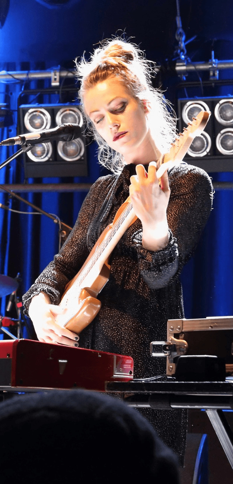
She is Paula, a self-taught guitarist who balances music with her job. She loves playing live and believes in collaboration within the local scene, but feels that the organizational burden drains her creative energy.
User persona
Paula
35 years old, guitarist
Who is it?
•
He learned to play the guitar in his adolescence.
•
Play in a group with three years of experience
•
Lives in a medium-sized city with an active music scene
•
It is responsible for closing concert dates and coordinating with other bands with which they will perform.
•
Combine music with another job
•
Income level is medium or low
•
Computer skills at the user level
What do you want?
•
Expand your network by connecting with other bands, promoters, venues, and creative profiles.
•
Making decisions and organizing without losing horizontality
•
Distributing tasks fairly
•
Simplifying economic management
•
Gain visibility beyond networks and streaming
What do you need?
•
A unified tool (communication, calendar, tasks, accounting, and files)
•
Flexible coordination (voting and shared availability)
•
Transparent distribution of responsibilities
•
Clear economic management
•
Support networks among agents in the music environment
•
Spaces where to find collaborators or substitutes, temporary or permanent
•
Direct connection with interested listeners.
•
Greater visibility of live events and nearby projects to foster cohesion in the local scene
In Paula's user journey while organizing a concert, the critical points detected in the interviews appear: fragmented communication, difficulty in coordination, opaque economic negotiations, and subsequent bureaucracy. The experience oscillates between the enthusiasm for playing and the exhaustion of managing it.
This analysis helped me build a list of requirements, not only functional but also emotional and environmental, that would guide the design of the app. The app was not meant to be just a management tool, but an integrated environment that unified tools and fostered connections among musical agents, an app that reduced organizational overload without losing collaborative logic.
Fragment of Paula's user journey when planning a concert

Card sorting
Based on the list of requirements, I created a content inventory and tested it with three users using an open card sorting composed of 54 cards. The results, analyzed through a dendrogram and a similarity matrix, revealed how the users themselves mentally group the functions of the app. The identified patterns led to 6 thematic areas (social, search, personal, events/band, support, and internal organization) that redefined the initial architecture and guided the final content tree.
Help
Searcher
Notifications
Social
My band
My profile
Iterated table of contents

Wireframes
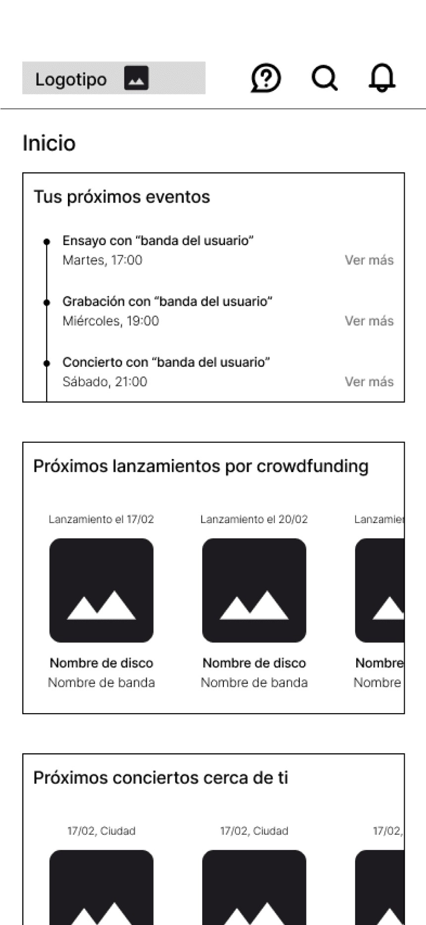
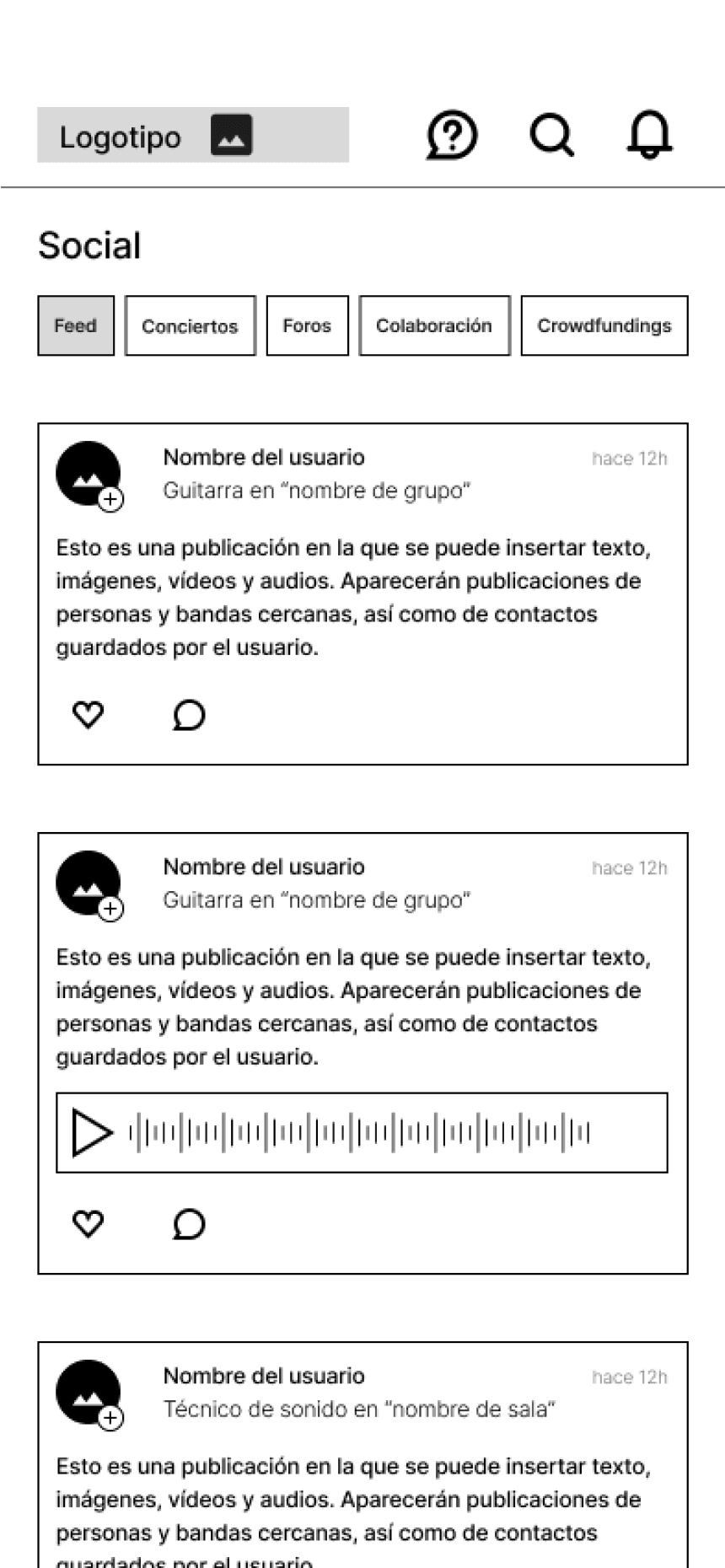
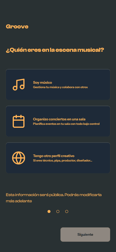
From the content tree, I created a flowchart and, with it, developed the low-fidelity wireframes to translate the architecture into actual navigation flows. This step allowed inconsistencies to be detected before investing time in visual design. For example, the screen asking “who are you in the musical scene?” changed order.
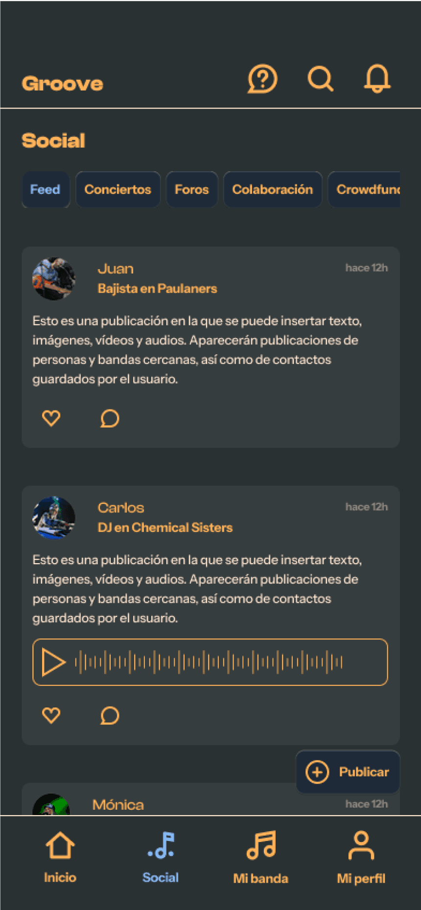
The navigation system is structured at two persistent levels: a top bar for global and occasional use functions (support, search, notifications) and a bottom bar with the main sections for recurring access: home, social, my band, and my profile. For secondary navigation, tabs and side submenus are combined according to the complexity of the content.


Graphic identity
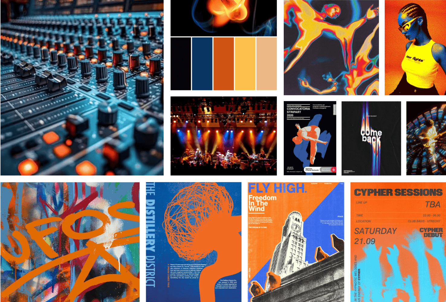
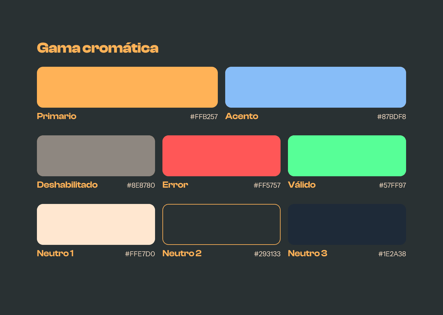
Before defining the style, it was necessary to understand what atmosphere Groove should convey. The visual direction stems from the spaces where independent music takes place: dim rehearsal rooms, small stages with stage lighting, mixing tables with glowing LEDs. An environment that combines rawness and energy, resilience and community. The moodboard collects references from concert posters, DIY aesthetics, and digital music production. From it, the criteria that underpin the entire system are extracted: dark background, orange and blue as complementary colors, high-weight typography, and gradients that give depth.
Style guide
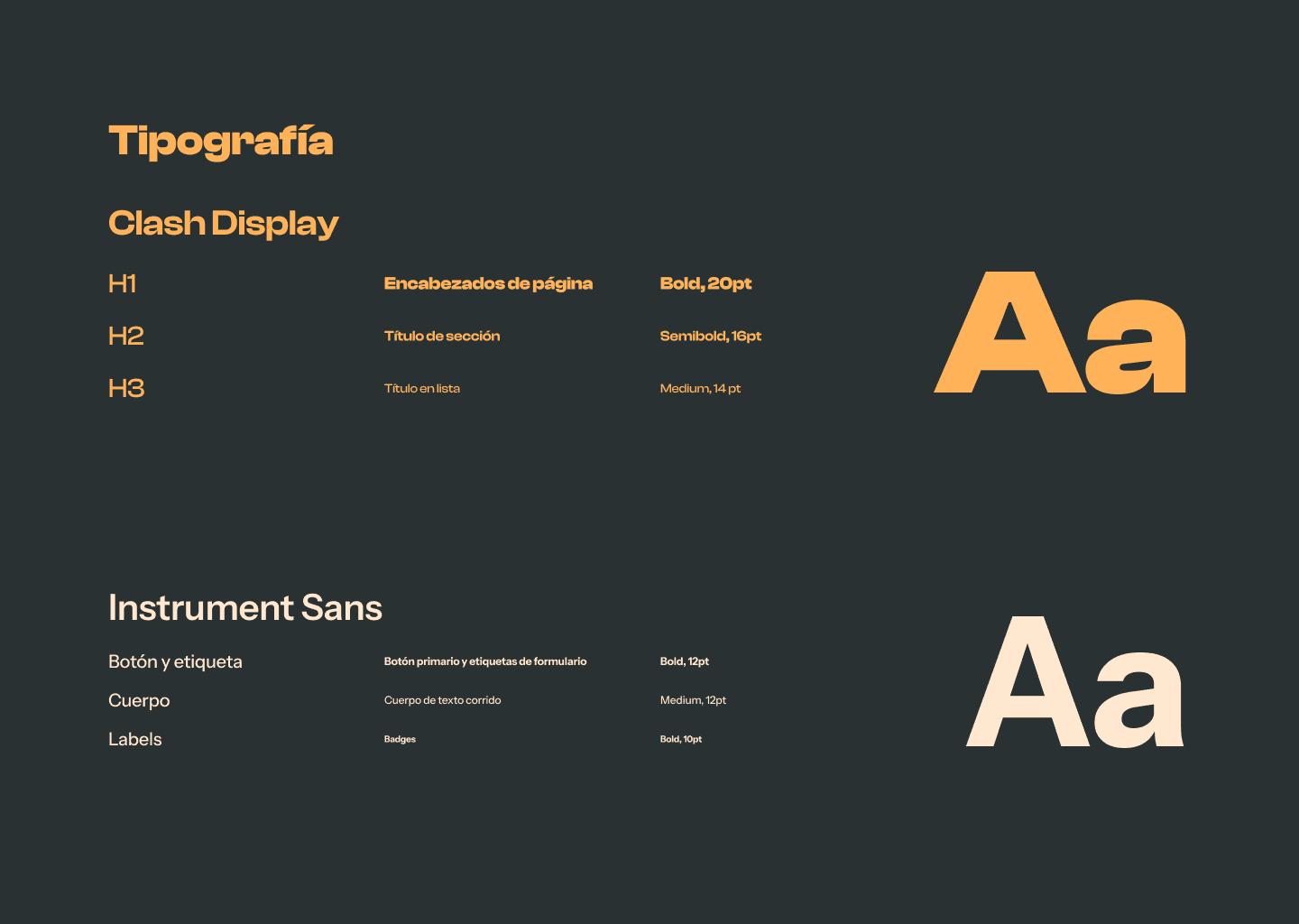
With the moodboard criteria, I developed a style guide that ensures the consistency of the system. The palette combines a primary orange, which evokes closeness and dynamism, with a cool blue as an accent, both over an anthracite gray background, generating a chromatic tension that refers to scenic lighting and exceeds the AA level of contrast according to WCAG 2.0.
For typography, Clash Display is used for titles due to its boldness, and Instrument Sans is used for body text because of its readability. From this foundation, I built a reusable component system that combines into composite elements like navigation bars.
Graphical user interface design
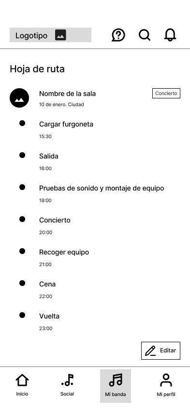
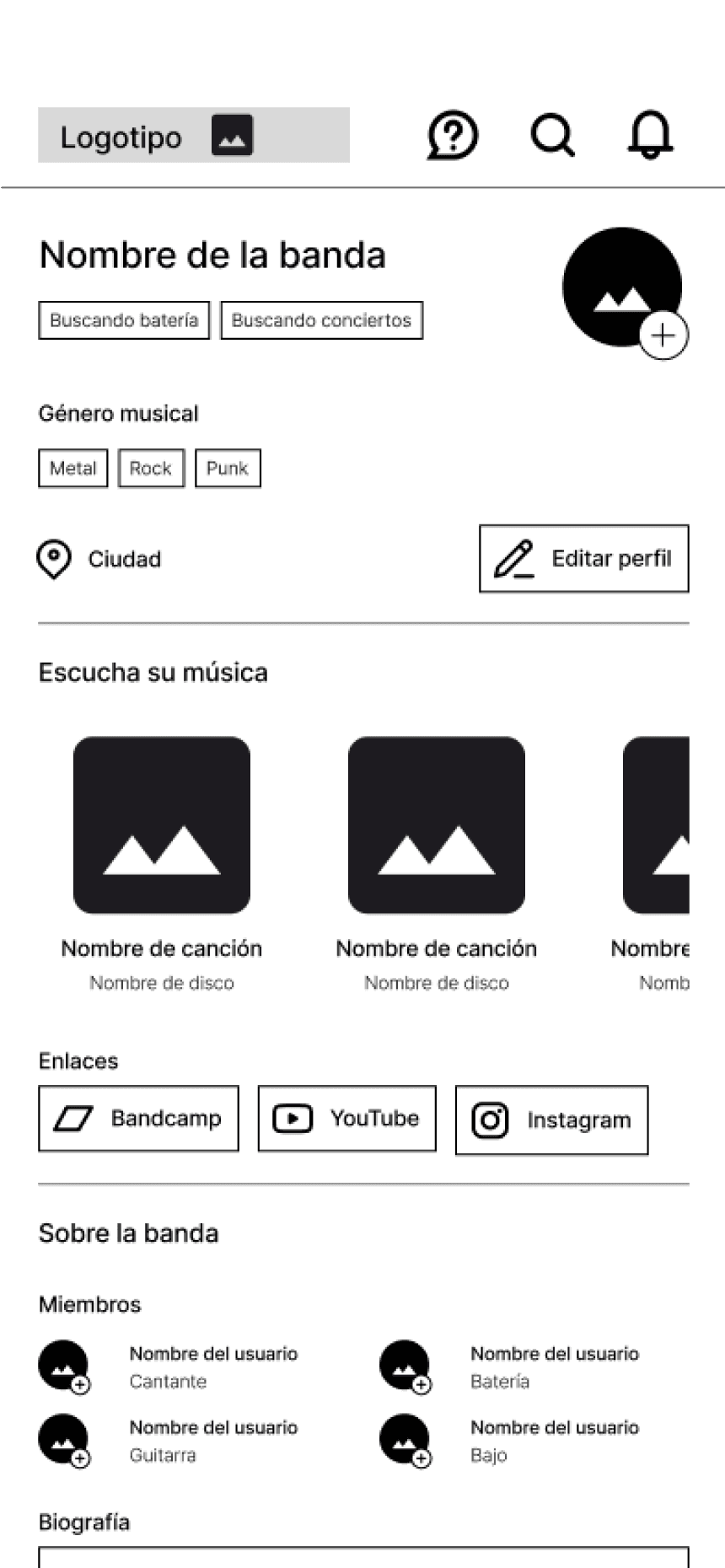
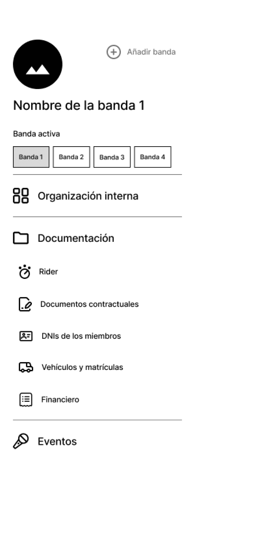
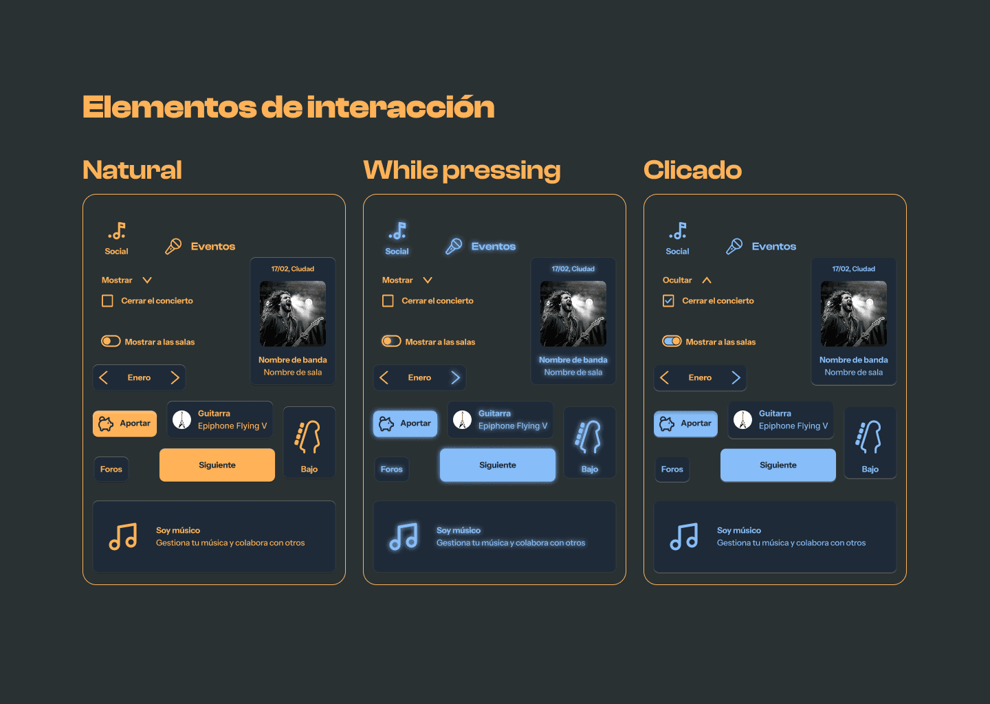
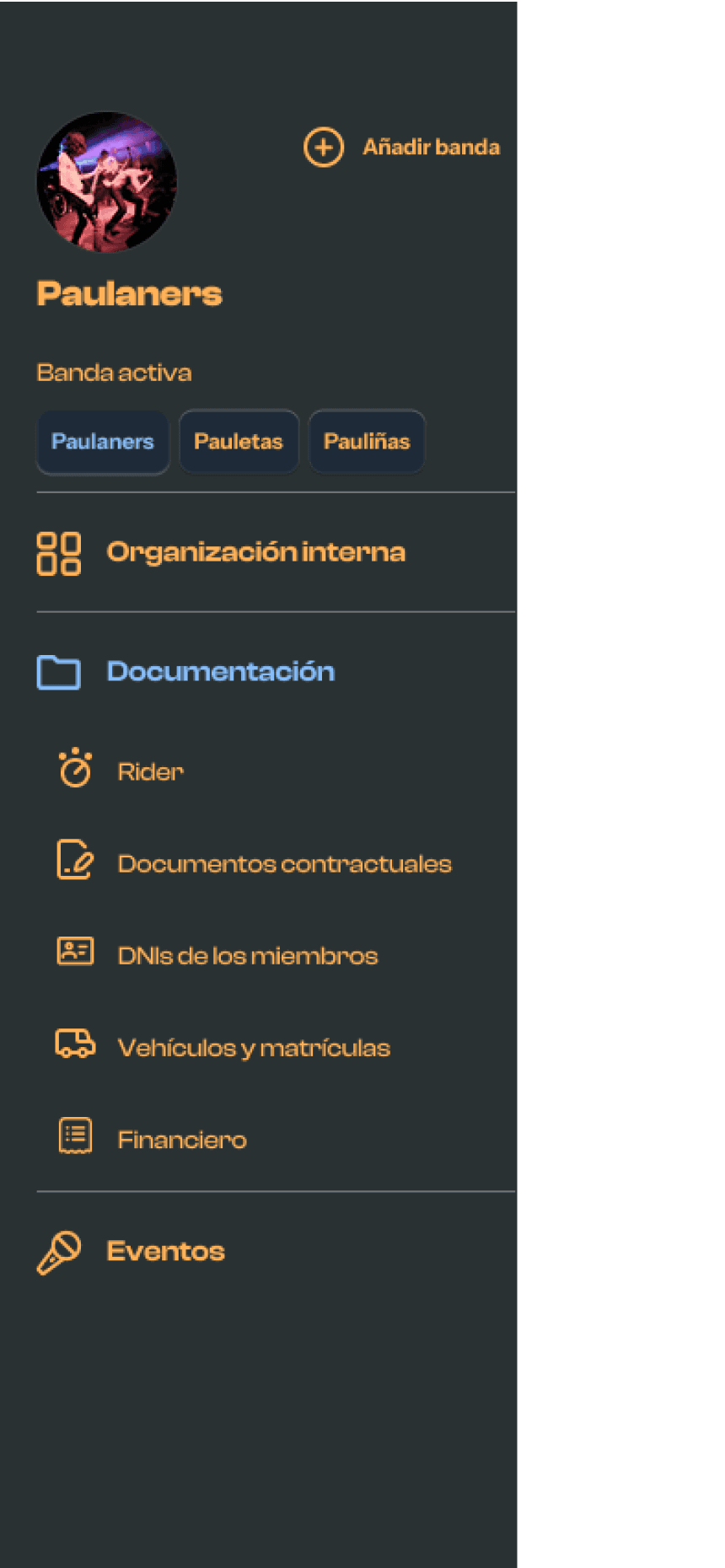
According to the criteria of the style guide and following the structure of the wireframes, I generated a high-fidelity interactive prototype. Developed entirely in Figma, it focuses on the main flow that articulates the entire project: creating and managing a concert, the most complex and representative stage of Paula's experience. The journey covers from onboarding to sharing the necessary documents with the venue, passing through the internal coordination of the band, the event roadmap, and material management.
Although it includes a large number of screens, all respond to a limited set of patterns and components, allowing the system to scale without losing consistency. Additionally, to ensure an intuitive experience, several of Nielsen's heuristics were applied: visibility of the system's state through color and microcopy, control and freedom with editing options, consistency in interactive elements, and recognizable iconography for the target audience, such as the knob to represent the rider.


Conclusions
Groove does not aim to solve the structural problems of the musical underground: precariousness cannot be solved with an app. What design can do is reduce organizational friction and strengthen the collaborative practices that already exist, without imposing foreign dynamics on their culture.
This project taught me that researching the context in depth makes a difference: decisions are not arbitrary, but respond to users' real mental models and values. The next natural step would be to validate the prototype through usability tests, to iterate before its development.